Content map
1. Structure Of A DTC Ecommerce Email2. Reaching Your Target Audience3. Email Layout4. Banner5. Navigation Bar6. Header7. Body8. Additional Modules9. Footer10. Headlines11. Call To Action
In the rest of our Beginner's Guide To Email Marketing, you've learned how to build an effective email marketing strategy. But no email strategy can be complete without effective, high-converting emails (duh!).
But with so many emails flooding inboxes every day, it can be challenging to stand out & get those opens, clicks and conversions. That's why it's crucial to understand the anatomy of an effective email and how to design emails that convert.
Whether you're a seasoned marketer or just getting started, this deep dive will teach you the anatomy of an effective email and provide tips and best practices for designing emails that convert.
The Structure Of A DTC Ecommerce Email

Reaching Your Target Audience
Before you even get to designing the email itself, you've got to make sure that your email subscribers will even open your email! That's where your From Name, Subject Line and Preview Text come in.
These three key elements are the first things your email subscribers see & it determines whether they'll choose to open your email.

From Name
The from name in an email is the name or company that appears in the "from" field of the email, indicating who the email is from.
This field, along with your email subject line & preview text, is one of the first things that a recipient sees when they receive an email, so it's important to choose a from name that recipients will recognize in their inbox & is aligned with your brand identity.
Most e-commerce brands stick to their company name as their "From Name", which is definitely a great way to go for your general marketing emails.
However, it can be worth testing using from names on different types of emails, such as:
• The name of your founder/CEO if they're recognizable
• The name of a person, such as a customer service representative, rather than just the company name, as this can help to establish a personal connection with the recipient (eg. Amy from Willow)
• If your brand is less recognizable, including the type of product you sell (eg. Willow vs Willow Clothing)
Subject Line
The subject line of your email is one of the most important parts of your email, since it's what your recipient will first see in their inbox to determine whether they want to open the email.
Let's start with the basics. When it comes to email subject lines, there are also few hotly debated topics such as the length, and the use of emojis, CAPS, symbols/punctuation & personalization.
Here's a quick summary of best practices when it comes to writing subject lines that play well with email clients:
Keep subject lines between 61-70 characters. That's the sweet spot to make sure it gets read & it fits in most recipient's email client.
Well-used emojis in subject lines can increase open rates - but don't throw them around randomly! Make sure they're relevant to the message.
Be careful with overusing CAPS, symbols (eg. $, %), and punctuation since they can trigger spam & promotion filters
Use personalization, such as including their name, to grab attention & increase open rates by over 25%
But writing a subject line for a successful email campaign goes beyond just the tactics above. You also need to make sure you can get your reader's attention. The best email marketers always remember that effective subject lines need to resonate with your audience.
Think about it this way, you have one sentence & only a second to grab a reader's attention. Is your subject line compelling enough?
Here are a few different approaches to writing an effective email subject line:
1. Create Curiosity
Get your email readers engaged by invoking curiosity through questions or an interesting statement such as:
• Are you cooking with toxins?
• Find out which outfit is for you
• MYTH: Breakfast is the most important meal
2. Give it a personal touch
Get their attention with personalization or conversation openers such as:
• Do you have dry skin?
• Marissa, we think you'll like this
• What's your color?
3. Create urgency or scarcity
When it comes to promotions or product launches, urgency & scarcity can go a long way to compelling interested shoppers to shop:
• Sale ends in T-3 hours
• You don't want to miss this
• Summer Limited Edition Prints: Almost GONE!
4. Keep it casual
Casual subject lines can work well since it'll catch readers' eyes seeming like it's an email from a personal contact:
• meet later?
• thanks
• think you'll like this
Preview Text
Preview text, often also called the pre header text, is the snippet of text that appears below the subject line in an email client.
It provides a brief preview of the content of the email and can influence whether the recipient decides to open it. Most ecommerce brands use the pre-header text as a way to share additional information readers might want as a follow-up to the subject line.
Keep this pre header text short, direct & most importantly, RELEVANT, to the email's subject lines. It should reinforce the subject line and provide additional context or information that may encourage the recipient to open the email.
Here's a quick summary of best practices when it comes to preview text:
• Keep it to 50-60 characters in length
• Avoid repeating the subject line - you want to add to it.
• Avoid simply using the first few sentences of your email as your preview text. Write a custom preview text for each email.
Email Layout
The email layout is essentially the structure of your email content and how each section of your email will layout visually. Think of it like a wireframe for your website.
The email layout helps separate logical divisions of the content of your email & ensures that there is a strategic, well thought out structure before you start copywriting & email design.
The most effective, high-converting email campaigns have a good email layout that makes it easy & engaging for customers to read. It also establishes a clear visual hierarchy of information so customers know what the most important information & actions are.
You can use a tool like Backbone to generate you a optimized, high-converting email layout for each of your email campaigns and flows. Most ESPs such as Klaviyo and Mailchimp also include email templates to give you a starting point in building your email layout.

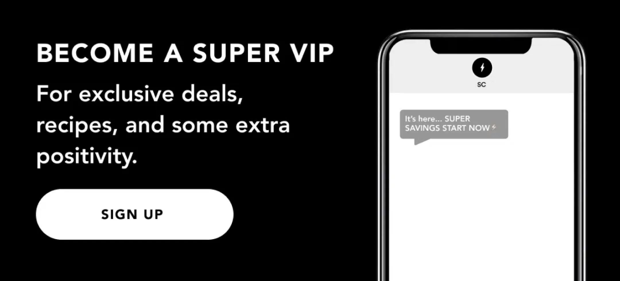
Banner
A banner in a DTC ecommerce email marketing campaign is a short module above the header, and sometimes above the navigation bar as well. Think of the banners you'll often see on a web page.
It's one of the first things a recipient sees when they open the email, so it's important that it is bold & eye-catching.
Some example use cases for a banner in a DTC ecommerce email campaign include:
• Promoting a sale or special offer
• Reminding customers of a new product that recently launched
• To drive urgency for a sale or product
• To encourage customers to opt-in to SMS
• To drive awareness for special programs, such as a loyalty or referral program
• To drive awareness for special announcements, such as the launch of a retail location or a partnership
An effective banner should have short, tagline-style copy that is bold and to-the-point. You don't have much space on a banner (often only 1-2 lines of text), so you want to communicate the main message clearly & directly. Some banners also include a call to action button to drive traffic to specific pages that may contain more information or allow recipients to shop.
Navigation Bar
This is a tactic taken from web design that is commonly used by DTC ecommerce brands. A navigation bar in email marketing is similar to those you would see on a ecommerce site web page, with links to a few key landing pages that are commonly visited by shoppers.
Here are a few typical pages to add to your email navigation bar:
• Shop
• Best Sellers
• New Arrivals
• High-converting collection pages (ie. Shop Men's, Shop Women's)
• High-converting product pages
• Blog
The goal of a navigation bar is to increase clickthrough rates by providing direct links to the most popular pages. Most email clients have a built-in navigation bar that you can easily drag and drop into your email builder.
Header
The header of your email is one of the most important components of your email since it is the first thing a recipient sees when they open your email.
The objective of the header is to hook the reader's attention in to either continue reading or to click through to shop. This means it needs to be eye-catching, clear & compelling.
An effective header always has:
• A bold, engaging headline to get the reader's attention
• Attractive, eye-catching product photography or design elements to stand out visually
• A clear call to action to direct the reader on what to do next
Pro Tip:
The No-Scroll Test is a quick test you can use when reviewing your email headers to see if it is effective & compelling to get recipients to read the rest of the email.
Review this email as if you’re on the bus or in line flipping through this email in your inbox quickly without scrolling.
If you just look at the header:
Is it clear what the email is about? Do you see a call to action button?
Does it make you want to click or continue reading?
Header Examples :


Body
The body of a DTC ecommerce email is the main content section of the email that provides information and promotes products to the recipient. The body of the email should be visually appealing and easy to read, and it should effectively convey the message and call-to-action of the email.
The body of the email should provide additional information that the recipient needs to get them to click through to make a purchase or understand more about your brand.
There are several common types of modules that are frequently used in the body of DTC ecommerce emails, such as product highlight modules, product grid modules, blog roundups, and information blocks.
Product grid modules promote best selling products & display multiple products in a grid format, making it easy for recipients to browse and compare products. Product highlight modules focus on a single product, showcasing its features and benefits in more detail. Blog roundup modules provide links to recent blog posts, providing a way to promote the company's blog and drive traffic to the website. Information blocks provide important information, such as shipping information or customer service contact information.
The body of an email is where the majority of the email's content is displayed, so it's important to carefully consider the design and structure of this section to ensure that it effectively communicates the message and drives conversions. By using a combination of these different types of modules and incorporating best practices for design and layout, you can create emails that effectively promote their products and drive conversions.
Pro Tip:
The 5-Second Scroll is a quick test you can use when reviewing the body of your email to make sure it is cohesive & communicates the main message of your email clearly.
Review this email as if you’re doing a quick single scroll on your phone:
• Is it clear what this email is about?
• Is it clear from each section what you'll learn from this email?
• Is it clear what the main call-to-action of the email is?
Body Examples :
.webp)


Additional Modules
In addition to the main body of the email, there are a variety of additional modules e-commerce brands include as add-ons to share additional information. These add-on modules are designed to increase engagement and drive conversions.
A few common ways additional modules are used include driving awareness for SMS & loyalty programs, recommending additional products or content, and reminding potential shoppers of an ongoing promotion.
SMS opt-in modules allow recipients to sign up for SMS updates and promotions, providing a new channel for marketers to reach their audience.
Loyalty program modules highlight the company's loyalty program, encouraging customers to engage and earn rewards.
Product recommendations modules suggest additional products based on the recipient's previous purchases or browsing history, helping to increase the average order value.
Content recommendations modules suggest related blog posts or other content that might be of interest to the recipient, increasing engagement and driving traffic to the website.
Ongoing promotion push modules provide a reminder of an ongoing promotion, encouraging recipients to take advantage of the offer before it expires.
By incorporating these additional modules into their email campaigns, DTC ecommerce owners and marketers can create a more comprehensive and engaging experience for their audience, driving conversions and building brand loyalty.
Additional Module Examples :


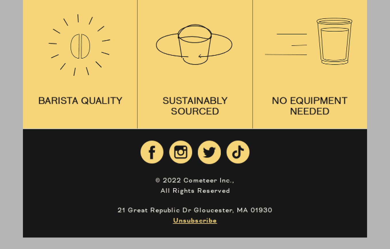
Footer
The footer is often an under-utilized portion of an effective email, because it is a space that can be used to help an e-commerce brand establish legitimacy & build trust.
The footer is the bottom section of the email that typically contains important information such as the company's physical address, contact information & unsubscribe link. It can also include social media icons, links to key web pages.
One way many e-commerce brands leverage the footer of their email to create an enjoyable user experience is by including links & information to their customer service or support pages. Many brands also use the footer to highlight key value propositions such as free shipping, satisfaction guarantee, or other features of their brand.
Here are several key elements to include in your footer:
• Unsubscribe link
• Contact information
• Social media icons
• Links to high-converting/popular pages
• Links to customer support
• Key value propositions to convert customers such as free shipping, satisfaction guarantees & specific brand/product features (eg. Non-GMO, Sustainable etc.)
Footer Examples


Headlines
Headlines are the key message or title that is displayed prominently in each module or section of the email.
The most important headline is the one in the your email header since this is what the recipient will see first when the open the email. The headline of your email header determines whether the reader clicks to your website, continues reading the email, or closes it. It also sets the tone for the rest of the email content.
It should also be aligned with the email's subject line and preview text to create a consistent message throughout the email.
Depending on your email layout, you may also have additional sub-headlines in each of the sections of your email. These headlines should be short, easy to read & tell the reader what to expect in that section of the email to get them to continue reading.
For copywriters, it's important to keep headlines simple, direct, and attention-grabbing. It needs to act as a hook, to continue grabbing the readers' interest throughout the email, while also being informative and relevant.
For designers, effective email design means keeping headlines eye-catching & often in a larger font. Many e-commerce brands use colors and typography to make the headlines stand out.
Headline Examples :


Call-To-Action (CTA)
A call to action (CTA) is a button or link within an email that encourages the recipient to take a specific action, such as making a purchase, reading a blog post, or visiting your website. CTAs are a crucial component of an effective email marketing campaign as they drive conversions and help achieve the desired outcomes for the email.
It's important to have at least one CTA in the header of your email, as well as multiple CTAs throughout your email.
For copywriters, it's important to use strong, action-oriented language in the CTA to encourage recipients to click through. Testing different versions of the CTA language can help determine the most effective phrasing for your email subscribers.
Designers should also keep in mind that when it comes to effective email design, CTAs need to stand out visually from the rest of the email. This is often done by using bolder, contrasting colors, larger font sizes & different typography to make the CTA more prominent and increase its click-through rate.
It's also important to make sure the CTA buttons are easily seen & clickable for both desktop and mobile users.
Call-To-Action (CTA) Examples :